CHALLENGE: HUD REVAMP
Following the feedback from the playtest, it became clear that the layout of the HUD screen needed to be reorganized, as both gameplay and monetization were being impacted. This document aims to clearly outline the main points behind the decisions made and serves as a guide for other team members during the implementation process.
GOALS
- Enhance Situational Awareness
- Minimize Cognitive Load
- Immersion and Theme Consistency
- Enhance Situational Awareness
- Minimize Cognitive Load
- Immersion and Theme Consistency
Discovery → Define
COMPETITORS
To develop an effective HUD, several genres were merged to understand the best practices for specific characteristics. One significant challenge encountered in mobile flight games is optimizing the use of the screen.
As a first step in the design process, the main HUD elements were identified and categorized based on key points of interaction. This categorization was informed by an analysis of PlaytestCloud(PTC) and PTAAS (heat map internal tool), alongside prioritized feedback from players. The categories include: Navigation, Main Actions (attack and defense modes), Enhancements, Visual Context, and Settings Information.
The layout analysis included a focus on each element, with the reticle being a top priority in the information hierarchy. Players use the reticle to navigate the environment and target enemies. Developing a new reticle required analyzing mobile shooter and flight games.
Sky Warriors reticle size (blue) compared to other shooting games (red)
INSIGHTS
- Redefine the information hierarchy based on player feedback and the screen heat map.
- Prioritize elements within the player's focus area (reticle).
- Implement animations in the reticle UI to provide feedback on the player's shooting actions.
- Present all relevant information for flight games, such as as airspeed, altitude, heading, course, and flight-path guidance symbology on the screen.
- Resize the buttons to match with main competitors.
Reticle's states
Develop → Deliver
In this phase of creating the proposals, Player Stories were developed using insights gathered from the initial stage. Several proposals were then created, incorporating both internal insights and feedback. To enhance the evaluation process, the proposals designed in FIGMA made testing easier.
Player Stories
DELIVERABLES
To support the engineer and art team, Player Stories and acceptance criteria were provided. Below are three key deliverables for the feature sections. While this high fidelity wireframe was approved for development, further improvements were made during the process.
1 - HUD ACCESS
As a player, during a match, I want quick and easy access to execute main actions so that I can react promptly in high-pressure situations.
ACCEPTANCE CRITERIA:
Launch missiles - The "Launch Missile" button should be visually distinct and clearly show a cooldown timer, indicating the time until the next missile launch.
Change Missiles - The "Change Missile" button should be placed directly below the "Launch Missile" button to prevent accidental presses, displaying an icon of the next missile type.
Flares - Position the "Flares" button near the "Launch Missile" button for quick access during critical moments, prioritizing ease of use in combat.
Enhancements - The enhancement drawer should display three clearly labeled and visually distinct options for quick selection.
2 - PLAYER INFORMATION
As a player, I want clear and accessible information about my shield status, remaining lives, and map location to make informed decisions during gameplay.
ACCEPTANCE CRITERIA:
Shield - Display the shield status with a clear, real-time updating slider.
Lives - Show the remaining lives using an easily identifiable indicator consistent with the shield design.
Map - The map should clearly show the player's location and be accurately scaled to the in-game environment.
Cargo Plane Identification - Each cargo plane must be marked and labeled dynamically on the map for clarity.
Objective - Display the current objective prominently, ensuring high visibility and good contrast for legibility in all lighting conditions
3 - PROGRESS PANEL
As a player, I want a progress panel that clearly shows the match's status, including objectives and milestones, so I can track my performance and goals.
ACCEPTANCE CRITERIA:
Main Goals Content - The panel should display essential match information, including:
Enemies - Represented by distinct flags or icons.
Allies - Clearly differentiated using consistent visual assets.
Timer - A countdown indicating match duration or key phases.
Cargo progress - A visual indicator of cargo objective progress.
Enemies - Represented by distinct flags or icons.
Allies - Clearly differentiated using consistent visual assets.
Timer - A countdown indicating match duration or key phases.
Cargo progress - A visual indicator of cargo objective progress.
Once the documentation is delivered, a kickoff session is held to define tasks for both engineering and art teams.
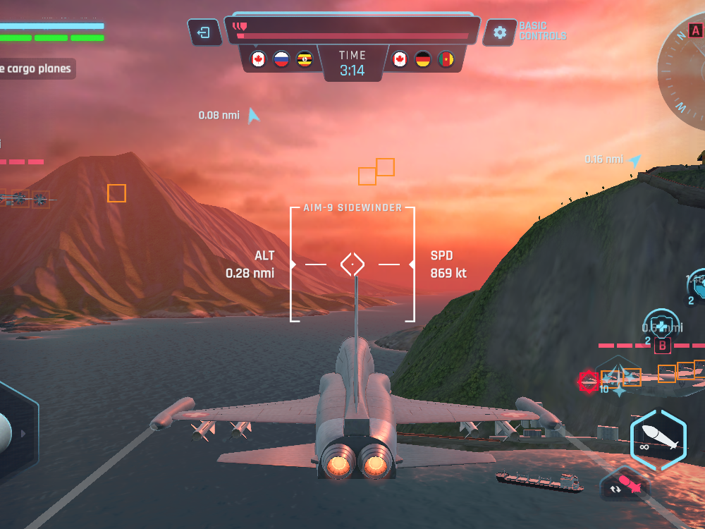
The final version that was implemented is as follows:
The final version that was implemented is as follows:
