Copyright Ten Square Games
DISCLAIMER: Due to confidentiality, the following case study is a reconstruction of my work on a discontinued project, intended to illustrate my work process and approach to UX/UI design.
DISCLAIMER: Due to confidentiality, the following case study is a reconstruction of my work on a discontinued project, intended to illustrate my work process and approach to UX/UI design.
Project: Undead Clash
Platform: Android, IOS
Tools: Figma, Illustrator, Photoshop, Unity
MY ROLE
Senior UX/UI Designer
We’re a remote-first team, and I collaborated with the UX/UI team, along with three other designers, as we rotated between squads to achieve our milestone goals. I worked with product managers, game designers, and developers to align the user experience with the game’s overall vision. By collaborating closely with these teams, I ensured that our communication and documentation were clear, which helped suggest improvements to the UX flow. Since the game had an established UI style, I focused on creating UI elements that aligned with the game's genre. In addition to designing assets, I was responsible for implementing them directly in Unity. Utilizing the project’s plugins, I created animations for buttons, pop-ups, and HUD elements, which enhanced user feedback and improved visual appeal.
We’re a remote-first team, and I collaborated with the UX/UI team, along with three other designers, as we rotated between squads to achieve our milestone goals. I worked with product managers, game designers, and developers to align the user experience with the game’s overall vision. By collaborating closely with these teams, I ensured that our communication and documentation were clear, which helped suggest improvements to the UX flow. Since the game had an established UI style, I focused on creating UI elements that aligned with the game's genre. In addition to designing assets, I was responsible for implementing them directly in Unity. Utilizing the project’s plugins, I created animations for buttons, pop-ups, and HUD elements, which enhanced user feedback and improved visual appeal.
The core gameplay feature of the game is its first-person shooter (FPS) simulation, which enables players to immerse themselves in battles against zombies within their real-world environments. The game includes live operations features such as events, daily missions, leaderboard rankings, and a Starline, all of which add a competitive element.
Project Goals
Combining the familiar formula from TSG's popular Fishing and Hunting Clash games with intense zombie combat
Soft-Launch: Validation of the gameplay loop, laying the foundation for LiveOps events, and introducing the Starline system with unique progression mechanics.
Target audience
Horror and Zombie Genre Fans: Players who enjoy horror themes, zombie apocalypses, and dark, intense settings are the primary audience.
TSG enthusiasts play Fishing and Hunting Clash: users interested in FPS experiences similar to the company's established games. The core gameplay of these games appeals to both casual gamers looking for fast-paced, action-packed gameplay and mid-core gamers who enjoy strategy and progression mechanics.
Workflow
User research & benchmark
We analyzed our target audience to better understand their behaviors, preferences, and pain points. Additionally, we examined our competition to understand industry standards and identify unique opportunities for improving our UX/UI.
The process included studying user data, gathering feedback from similar games, and leveraging direct insights from our internal data.
Wireframing & prototying
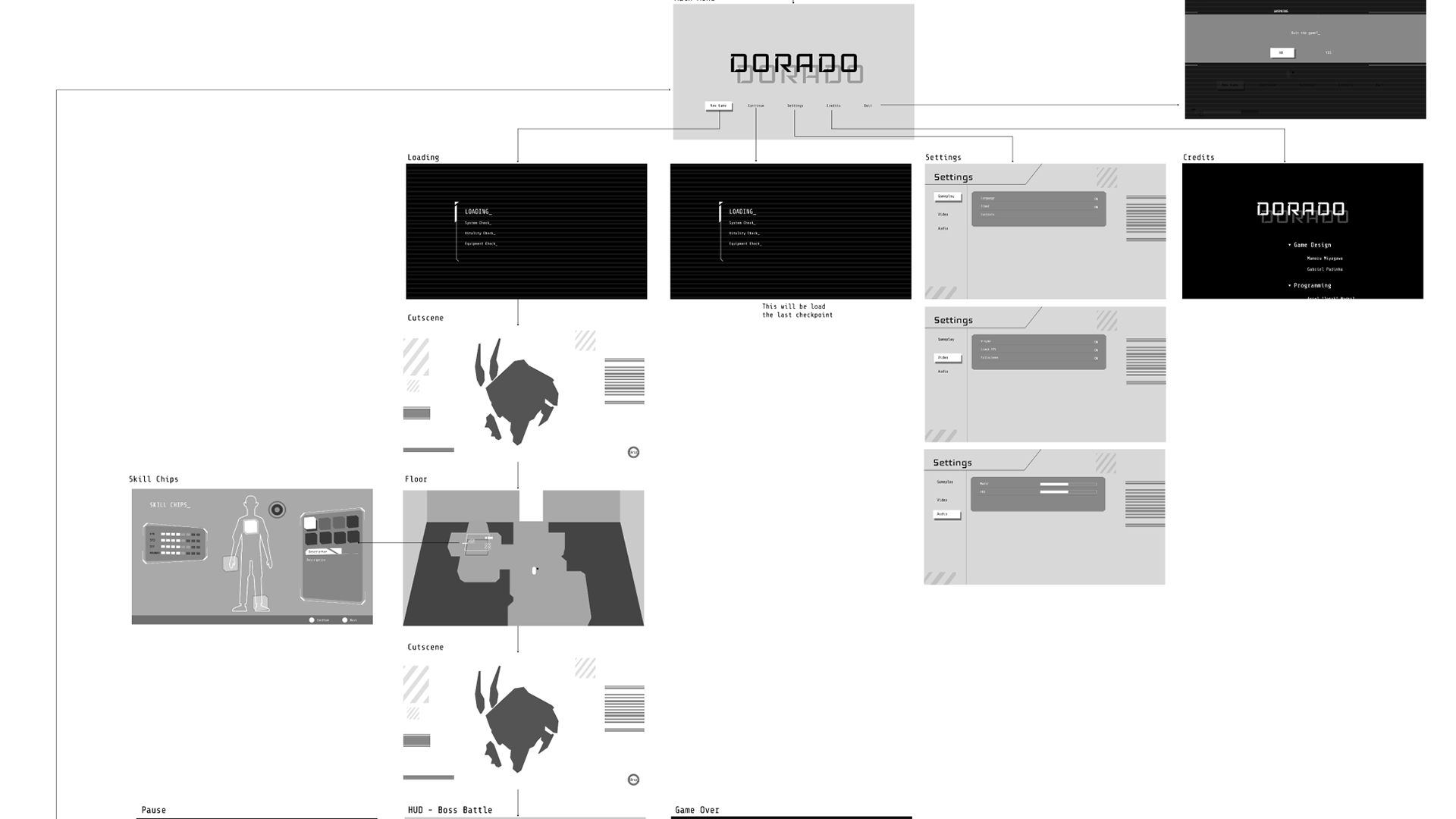
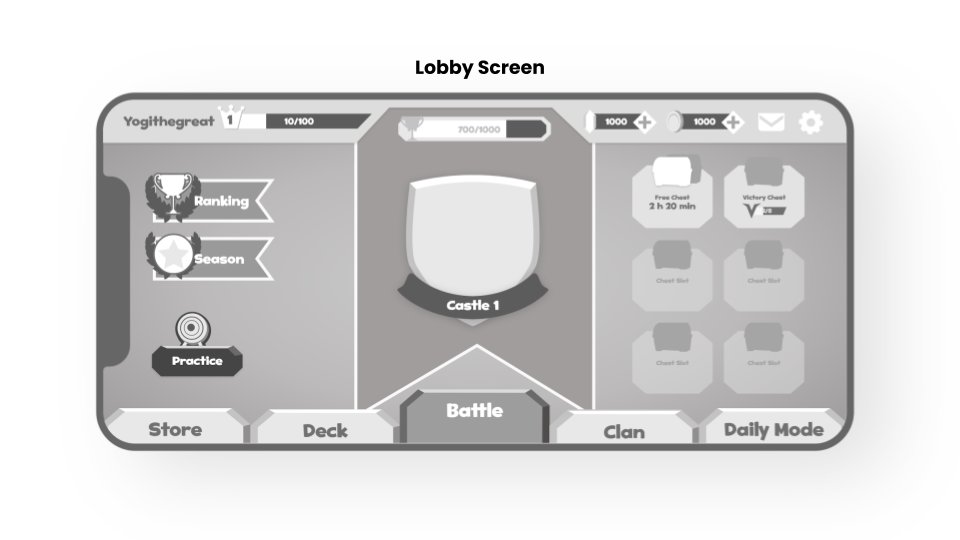
Developing basic wireframes to outline the structure and placement of elements was crucial for the entire process, especially since I was working entirely remotely. The prototype allows me to concentrate on rapid interactions, enhance functionality, and improve the user experience flow, while also facilitating the implementation by developers.
UI Design
Undead Clash had a defined art style that reflected grunge or scratched metal textures, a post-apocalyptic and immersive design that matched its dark and terrifying zombie shooting gameplay.
I created the UI elements to align with the UX/UI team's vision, using Figma for interactions and essential design. Additionally, Adobe Illustrator and Photoshop were utilized during this phase.
UI Implementation
Ten Square prioritized its active involvement throughout the development process, including during implementation, to ensure the layout matched the visual design established in the UI phase. As UX/UI designers, we took charge of exporting assets, executing animations on the canvas (Unity), and strictly following the optimization guidelines provided by the Tech Art team.
Playtest
We regularly conducted internal playtest sessions with our team to effectively validate features and identify bugs. To further reduce bias, the company organized an internal championship.
In addition to our team's efforts, we also arranged external playtests on the PlaytestsCloud platform, selecting profiles that closely resembled our target audience.
Using player feedback, we compiled a list of improvements and insights to make adjustments that enhance clarity, reduce friction, and improve the UX.
